How to Build a Weekly Usage Score in Userlens
How to Build a Weekly Usage Score in Userlens
Published

Hai Ta
Co-Founder

A customer with 500 seats will always generate more activity than one with 10 seats. But that doesn't mean they're more engaged.
That's the problem with raw usage numbers. They're skewed by account size. A normalized usage score fixes this.
It tells you how active each account actually is, on a per-user basis, so you can compare engagement across your entire customer base fairly.
Here's how to build a normalized usage score in Userlens.
What We're Building
The goal is to create a simple but meaningful metric for each customer account:
Weekly Usage Score = Total events last 7 days ÷ Unique active users last 7 days → Scored 0-10
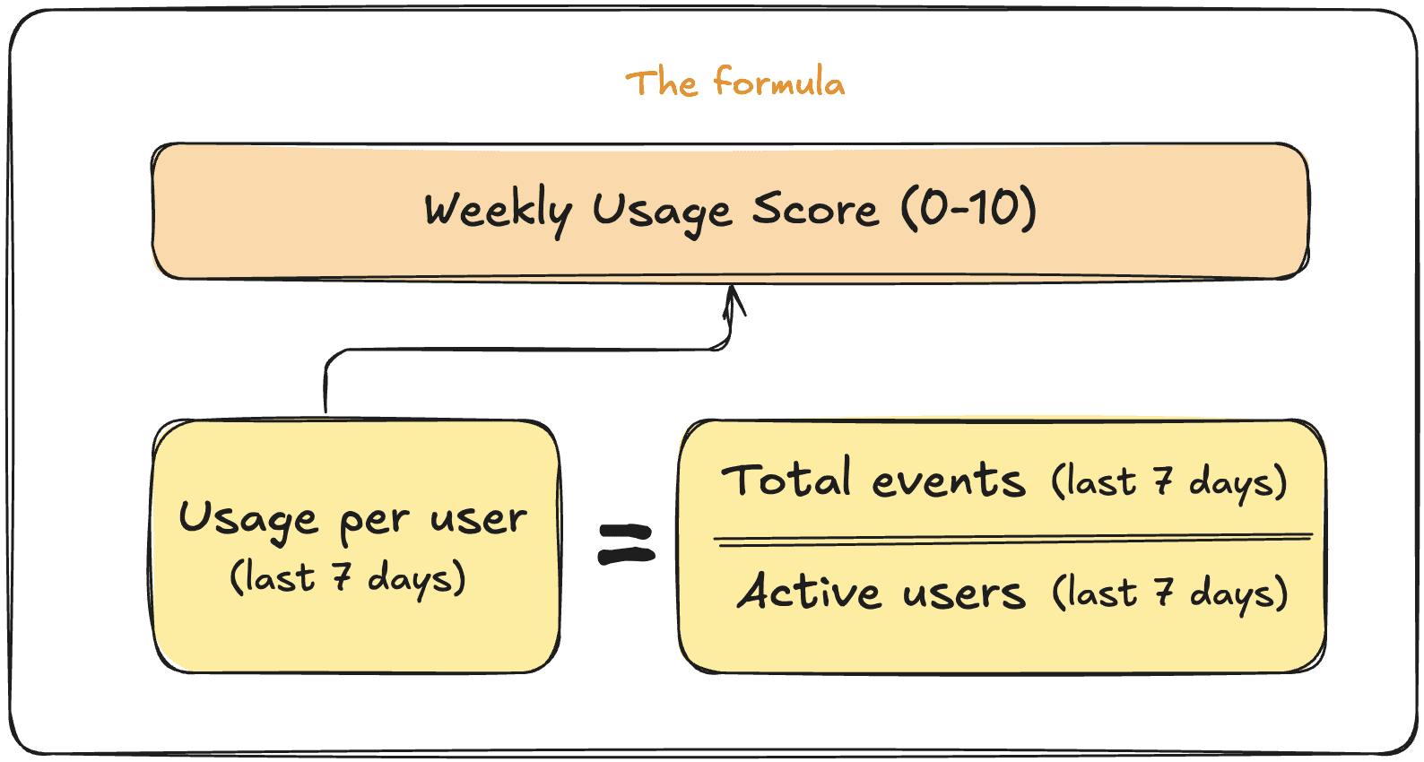
This gives you a normalized view of engagement that takes team size into consideration. A 5-person team logging 250 events is just as engaged as a 50-person team logging 2,500 events.
They both average 50 events per active user.
To build this, we need four computed properties:
Total usage last 7 days — the raw event count
Unique active users last 7 days — users who actually logged in
Usage per unique active user — the ratio of the two
Usage score (0-10) — a scored version for easy interpretation
Let's build each one.
Step 1: Total Usage Last 7 Days
First, we need to count all events across the account for the past week.
Navigate to Settings -> Company Properties -> Create Computed Property and fill in:
Name: Total usage last 7d
Output: Event count
Event filter: Any event
Time range: Last 7 days
This gives you a rolling weekly total that updates automatically. You can preview the current value for any specific company.
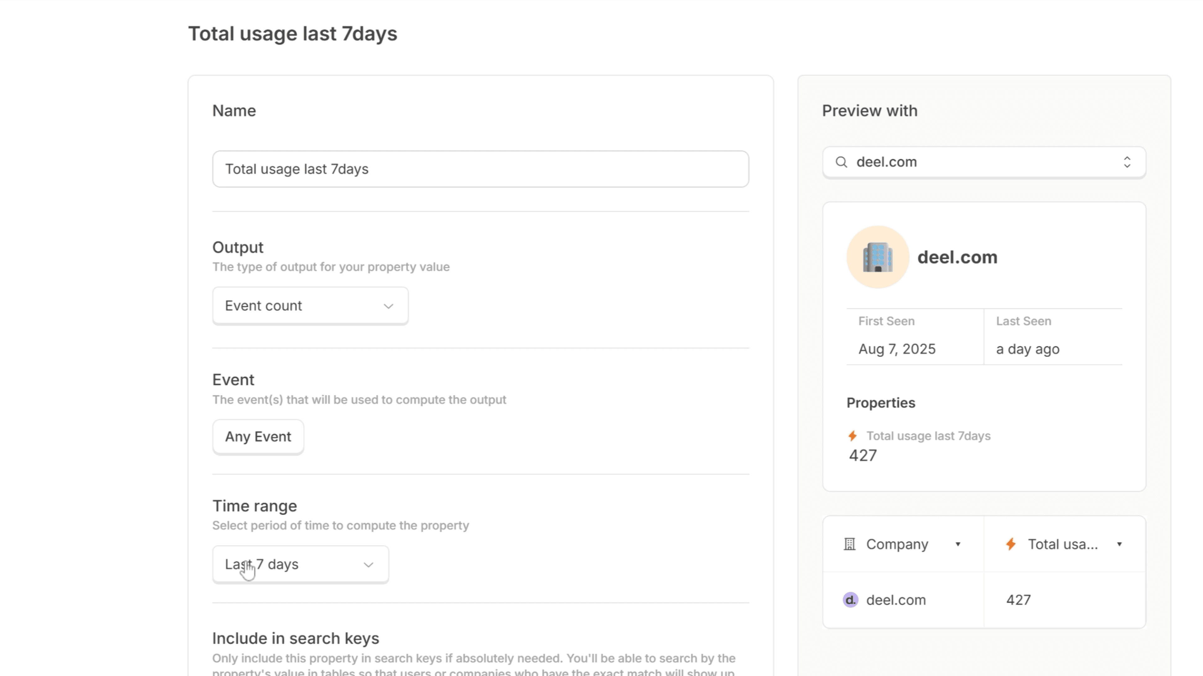
Creating a computed property for Total usage in the last 7 days in Userlens
Step 2: Unique Active Users Last 7 Days
Next, we need to know how many users actually showed up during that same window. This is your denominator. It ensures you're measuring engagement intensity, not just volume.
Create another computed property in a similar way:
Name: Unique active users last 7d
Output: Unique user count
Event filter: Any event
Time range: Last 7 days
This counts distinct users who triggered at least one event, giving you a true picture of how many people are actually using the product.

Creating a computed property for Unique active users in the last 7 days in Userlens
Step 3: Usage Per Unique Active User
Now we combine the two to get our normalized engagement metric.
Create a ratio-type computed property:
Name: Usage per unique user last 7d
Output: Ratio
Numerator: Total usage last 7d
Denominator: Unique active users last 7d
This tells you, on average, how many events each active user is generating per week. It's the core metric that makes cross-account comparison meaningful.
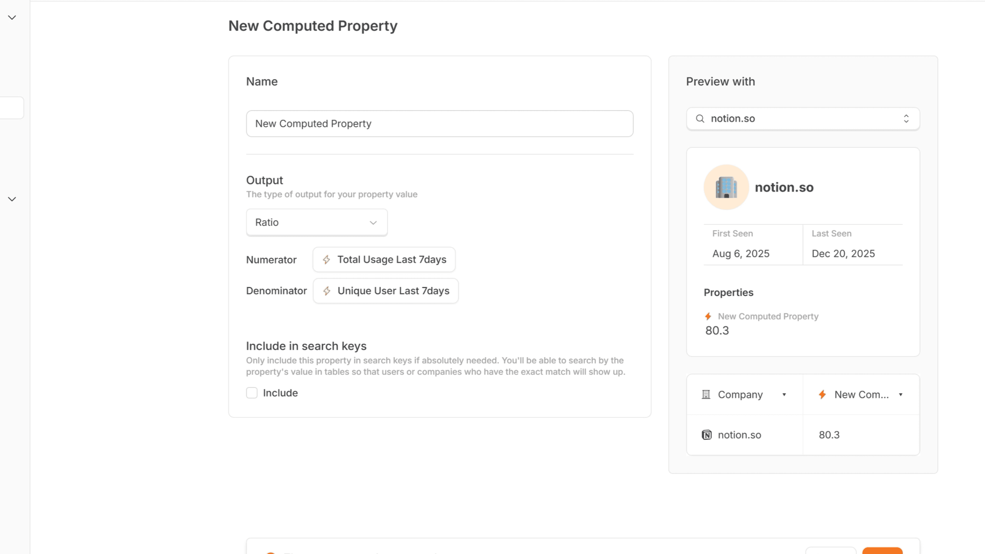
Computed property for Usage per active users in the last 7 days in Userlens
Step 4: Finding Your Benchmark
Before creating the final score, you need to understand what "good" looks like for your product.
Go to your customer list and add the "Usage per unique user last 7d" property as a column. Sort by this value to see the distribution.
Look at your healthiest customers. The ones you know are getting value, who renew without issue, who expand over time; what's their usage per user?
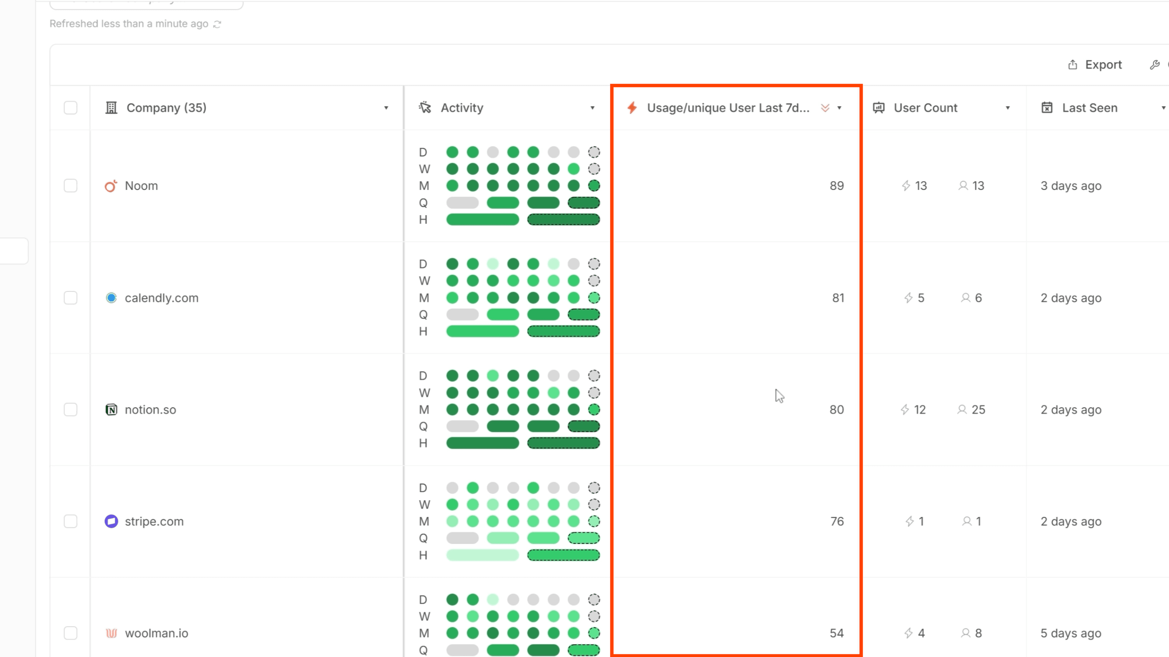
In my case, top customers were hitting around 80 events per user weekly, and accounts I knew were healthy clustered above 50. So I used 50+ as my benchmark for a perfect score.
Your numbers might be different. The key is grounding your scoring in what you already know about account health.
Step 5: Creating the Usage Score (0-10)
Finally, we translate the ratio into an intuitive score.
Create a formula-type computed property:
Name: Usage score (0-10)
Output: Formula
For the formula itself, you'll want logic that:
Scores 10 for anything above your benchmark (in my case, 50+)
Scales proportionally from 0-10 for values below that threshold
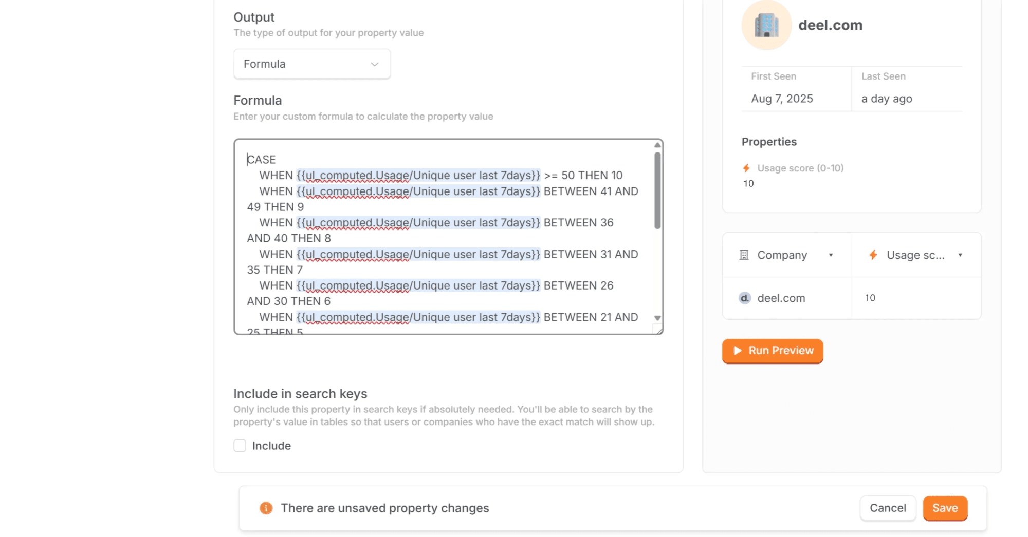
I used Claude to generate the SQL for this. Just describe what you want: "Score 10 if usage per unique user is 50 or above, then scale linearly from 0-10 for values between 0 and 50."
The exact formula will depend on your benchmark, but the structure is straightforward: a conditional that caps at 10, with proportional scoring below.
Putting It All Together
With the score created, go back to your customer list and add the "Usage score (0-10)" column by clicking on Columns at the top right corner of the table.
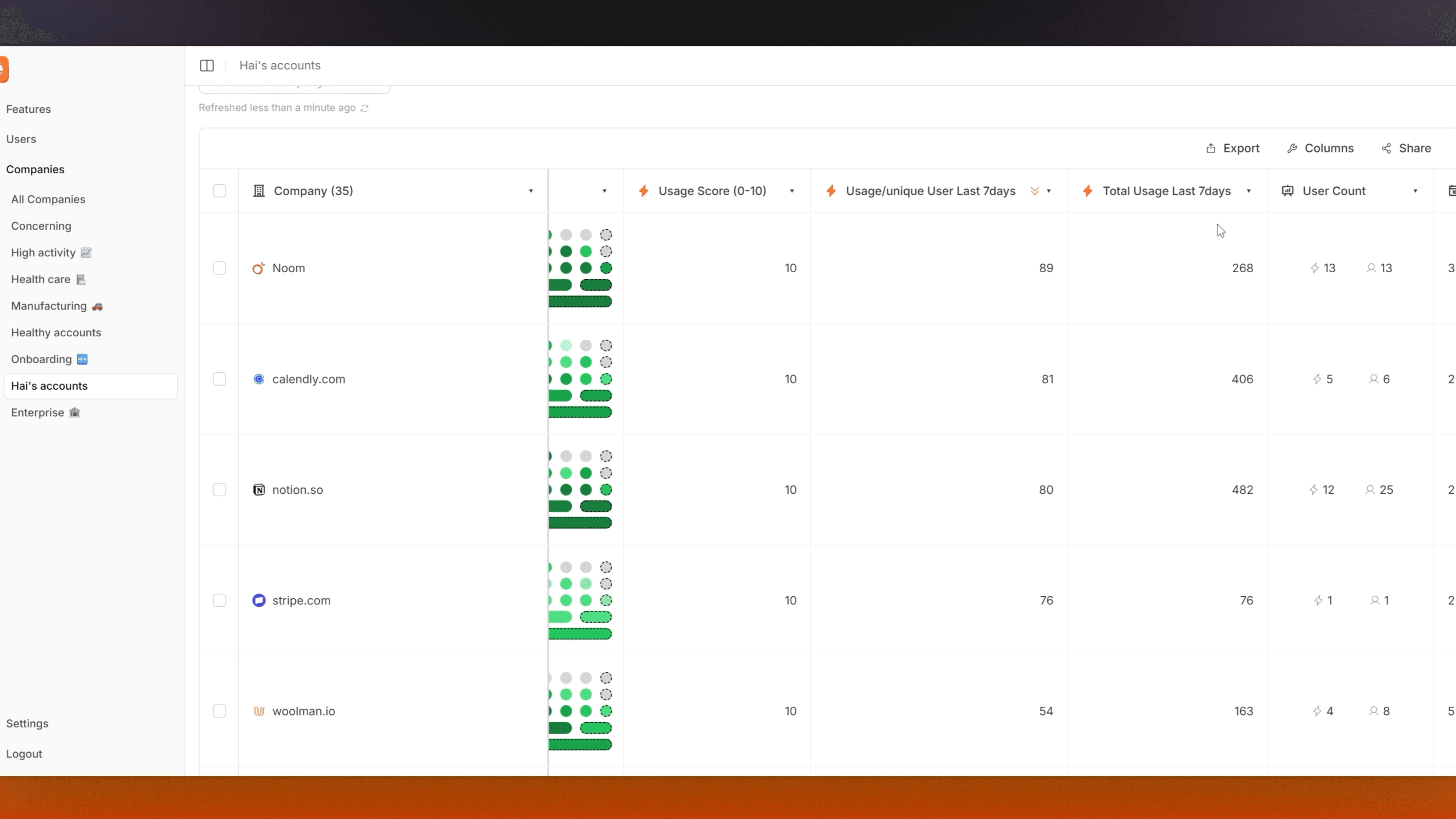
Now you have a single number that tells you how engaged each account is, regardless of their size. Sort by the score and you'll see it aligns with your usage per user ratio. As youhe new score is much easier to interpret at a glance.
An account with a score of 3 needs attention. A score of 8 or 9 is a potential expansion candidate. And you can make these assessments instantly across your entire book of business.
Why This Matters
Raw usage data is noisy. An enterprise account will always generate more events than a startup, but that doesn't mean they're more engaged or less likely to churn.
By normalizing to active users and applying a score, you get a consistent way to:
Prioritize customer success outreach — focus on low scores first
Identify expansion opportunities — high scores often signal teams ready to grow
Track engagement trends — watch how scores change over time
Segment your customer base — build cohorts based on engagement levels
The scoring approach also makes this data accessible to anyone on your team. A sales rep doesn't need to know that 47 events per user is concerning. They just need to see a score of 4.
Next Steps
Once you have this score in place, consider:
Adding it to your default customer list view
Setting up Slack alerts for accounts that drop below a threshold
Building a dashboard that tracks score distribution across your customer base
Combining it with other signals (like support tickets or feature adoption) for a fuller picture of account health
The weekly usage score is one piece of the puzzle, but it's a foundational one. With the tips above, you'll have that sorted out automatically on Userlens.
A customer with 500 seats will always generate more activity than one with 10 seats. But that doesn't mean they're more engaged.
That's the problem with raw usage numbers. They're skewed by account size. A normalized usage score fixes this.
It tells you how active each account actually is, on a per-user basis, so you can compare engagement across your entire customer base fairly.
Here's how to build a normalized usage score in Userlens.
What We're Building
The goal is to create a simple but meaningful metric for each customer account:
Weekly Usage Score = Total events last 7 days ÷ Unique active users last 7 days → Scored 0-10
This gives you a normalized view of engagement that takes team size into consideration. A 5-person team logging 250 events is just as engaged as a 50-person team logging 2,500 events.
They both average 50 events per active user.
To build this, we need four computed properties:
Total usage last 7 days — the raw event count
Unique active users last 7 days — users who actually logged in
Usage per unique active user — the ratio of the two
Usage score (0-10) — a scored version for easy interpretation
Let's build each one.
Step 1: Total Usage Last 7 Days
First, we need to count all events across the account for the past week.
Navigate to Settings -> Company Properties -> Create Computed Property and fill in:
Name: Total usage last 7d
Output: Event count
Event filter: Any event
Time range: Last 7 days
This gives you a rolling weekly total that updates automatically. You can preview the current value for any specific company.
Creating a computed property for Total usage in the last 7 days in Userlens
Step 2: Unique Active Users Last 7 Days
Next, we need to know how many users actually showed up during that same window. This is your denominator. It ensures you're measuring engagement intensity, not just volume.
Create another computed property in a similar way:
Name: Unique active users last 7d
Output: Unique user count
Event filter: Any event
Time range: Last 7 days
This counts distinct users who triggered at least one event, giving you a true picture of how many people are actually using the product.
Creating a computed property for Unique active users in the last 7 days in Userlens
Step 3: Usage Per Unique Active User
Now we combine the two to get our normalized engagement metric.
Create a ratio-type computed property:
Name: Usage per unique user last 7d
Output: Ratio
Numerator: Total usage last 7d
Denominator: Unique active users last 7d
This tells you, on average, how many events each active user is generating per week. It's the core metric that makes cross-account comparison meaningful.
Computed property for Usage per active users in the last 7 days in Userlens
Step 4: Finding Your Benchmark
Before creating the final score, you need to understand what "good" looks like for your product.
Go to your customer list and add the "Usage per unique user last 7d" property as a column. Sort by this value to see the distribution.
Look at your healthiest customers. The ones you know are getting value, who renew without issue, who expand over time; what's their usage per user?
In my case, top customers were hitting around 80 events per user weekly, and accounts I knew were healthy clustered above 50. So I used 50+ as my benchmark for a perfect score.
Your numbers might be different. The key is grounding your scoring in what you already know about account health.
Step 5: Creating the Usage Score (0-10)
Finally, we translate the ratio into an intuitive score.
Create a formula-type computed property:
Name: Usage score (0-10)
Output: Formula
For the formula itself, you'll want logic that:
Scores 10 for anything above your benchmark (in my case, 50+)
Scales proportionally from 0-10 for values below that threshold
I used Claude to generate the SQL for this. Just describe what you want: "Score 10 if usage per unique user is 50 or above, then scale linearly from 0-10 for values between 0 and 50."
The exact formula will depend on your benchmark, but the structure is straightforward: a conditional that caps at 10, with proportional scoring below.
Putting It All Together
With the score created, go back to your customer list and add the "Usage score (0-10)" column by clicking on Columns at the top right corner of the table.
Now you have a single number that tells you how engaged each account is, regardless of their size. Sort by the score and you'll see it aligns with your usage per user ratio. As youhe new score is much easier to interpret at a glance.
An account with a score of 3 needs attention. A score of 8 or 9 is a potential expansion candidate. And you can make these assessments instantly across your entire book of business.
Why This Matters
Raw usage data is noisy. An enterprise account will always generate more events than a startup, but that doesn't mean they're more engaged or less likely to churn.
By normalizing to active users and applying a score, you get a consistent way to:
Prioritize customer success outreach — focus on low scores first
Identify expansion opportunities — high scores often signal teams ready to grow
Track engagement trends — watch how scores change over time
Segment your customer base — build cohorts based on engagement levels
The scoring approach also makes this data accessible to anyone on your team. A sales rep doesn't need to know that 47 events per user is concerning. They just need to see a score of 4.
Next Steps
Once you have this score in place, consider:
Adding it to your default customer list view
Setting up Slack alerts for accounts that drop below a threshold
Building a dashboard that tracks score distribution across your customer base
Combining it with other signals (like support tickets or feature adoption) for a fuller picture of account health
The weekly usage score is one piece of the puzzle, but it's a foundational one. With the tips above, you'll have that sorted out automatically on Userlens.
© All rights reserved. Userlens 2026
© All rights reserved. Userlens 2026
© All rights reserved. Userlens 2026